Examples of Parallax Effects
Some Background on Parallax Scrolling: What is it?
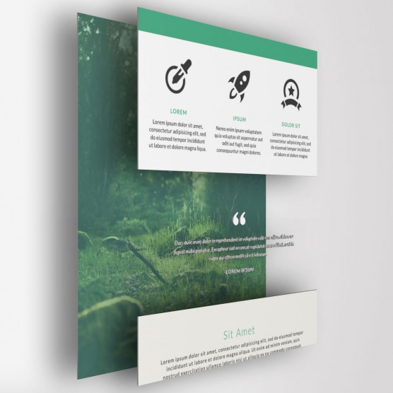
Parallax scrolling, also called layered motion, has been around for decades. It has long been utilized in animation and video games, as early as the late 1920s and early 1980s, respectively. You may very well recognize it in many of your favorite classic cartoons such as The Flintstones or Scooby Doo. So, what exactly is this parallax scrolling? To put it simply, it is using a composition of multiple layers, such as a foreground, middleground, and background, that move at different speeds.
This simple concept creates a sense of depth and helps change the experience that someone has with visual media. Although this concept has been around for nearly a century in other forms, it didn’t begin being used in web design until around 2011.
Parallax and Web Design
Since 2011, parallax scrolling has burst onto the scene of web design, beginning with simply iterations to add an element of depth and evolving into complex, multi-layered experiences that include opacity and focus shifts, videos, complicated animations, and multi-directional journeys. Indeed, parallax can completely alter a user’s experience with a website, but not always for the better. So when exactly should you think about using parallax? And perhaps more importantly, when should you avoid it?
Parallax offers a myriad of great options to improve a user’s experience on a website. Perhaps you need to show animation of how a product is built or stages of development. Maybe you need to tell a story. Parallax can greatly aid the presentation of a story through imagery and animation, such as with Portrait of a Serial Winner on ESPN. ESPN, Newsweek, and others have created great layouts for longer magazine articles, like Portrait of a Serial Winner, that incorporate parallax elements to help break up long sections of text, engage the user, and enhance the story.
It can also communicate a level of thought and intentionality that a flat web design may not. Some of the examples that follow communicate luxury, ingenuity, and elegance to their sites through various parallax effects. If those circumstances fit your needs, then great! Just remember to SIMPLIFY as you go throughout the process, because...
Parallax can bog down a browser, especially one that is out of date! Make sure that you know your audience beforehand. Is your audience typically up to date and on top of new trends? Will the machines they are using be able to handle the design you want to create? The last thing you want to do is create an experience that frustrates a user. No matter how great the intention or how beautiful the design, if a user is not able to navigate the site or cannot properly see and experience the site, they will leave with a negative impression.
Remember, good design is always intentional and purposeful. Parallax is a very beautiful and effective tool when used well. Be sure to avoid adding “cool” effects simply for the sake of “cool” effects. Plenty of trends have been used and abused by trigger-happy designers without real reason for their actions. Remember the age of animated-gifs? AKA the reason we all hated MySpace? Adding 72 pieces of clip art, sparkles, audio, and 12 animated gifs to a site is never enjoyable for anyone. With that said, I’d like to share some of the most common parallax effects and the great things people are doing with parallax on the web.
Project Ricochet is a full-service digital agency specializing in Open Source.
Is there something we can help you or your team out with?
Common Parallax Scrolling Effects
Dual-Layer Scrolling
Static
This is most easily done with a static background image that is seen through a window in the top layer as the user scrolls. Text and other elements can float in this window and be laid overtop of the background, as seen in these two examples:
Varying Speeds
This is the same concept, however, both layers are moving at different speeds:
Multiple Layer Scrolling
These sites utilize a number of layers scrolling at varying speeds to achieve depth and interest on their site, though done in quite different manners:
Also, there is a very simple example in the second section here:
Horizontal Scrolling
This is done with the same effects found in other parallax sites, but moving along a horizontal (or sometimes a combination of both) axis:
Video Backgrounds
Many parallax sites take advantage of using video backgrounds with parallax, often with some sort of color mask, and float text or other elements over top of them:
Sliding/Animating Object Appearances
Rather than just have objects already exist on pages, many sites try to engage the users by having certain elements slide, fade, or animate into place on the page. Lexus and Honda uses this feature to add a little life to their sites:
Pressels also uses many examples of object animation and varying methods of bringing elements onto the page:
Animated Statistics
Showing information through charts, graphs, or numbers has become much more engaging through the use of parallax. Animations triggered by scroll position now show graphs being formed, counters reaching their total, and a myriad of other options. Here are a few examples:
- http://www.designedtomove.org/en_US/?locale=en_US
- http://joyn.swiftideas.com/
- http://flexform.swiftideas.net/
Pages on the Side
Parallax means that sites are no longer limited to the traditional layout of pages. Instead of having a page disappear when the visitor is sent to a new, different page, you can store content to the side, top, or bottom and have it animate in when clicked. The user then returns to the previous section by sliding back over when done. Piccsy’s “Everything Design” site does a great job of demonstrating the possibilities of integrating all content into a single page:
Scroll-based Animation
Animation centered around parallax has become quite popular and this is reshaping the way people look at web design. Here are some great examples:
- http://www.exsus.com/highway-one-roadtrip/
- http://lostworldsfairs.com/atlantis/
- http://www.dangersoffracking.com/
- http://cyclemon.com/
Tracking distance
You can also track distance while scrolling on a site that is trying to show anything related to chronological time, height, depth, distance, etc. See this in action with the Space Needle or iutopi:
Cursor-based Animation
With the multiple layers of parallax, you can also program the site to respond to the cursor position and shift/animate accordingly. See it in action here:
Opacity Fade
In this last example of parallax effects, you can use the scrolling location to trigger an opacity fade on backgrounds or color masks:
Follow us on Twitter for news and updates.
Moving Forward with Parallax
As you can see, depending on the purpose, content, and desired aspects of the site, parallax can help create a modern, beautiful, and very interactive experience for the visitor. If you want your website to reflect cutting-edge and modern standards, if you need help effectively communicating a story, or if you want to add some high-end class to your site, get in touch with us at Ricochet so we can discuss if parallax is right for you.
Curious about how much it might cost to get help from an agency that specializes in Open Source?
We're happy to provide a free estimate!


